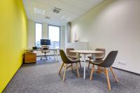
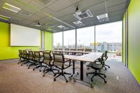
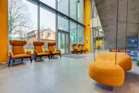
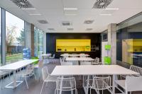
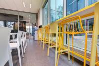
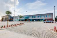
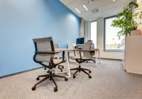
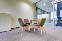
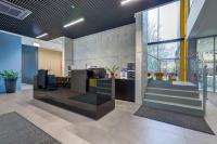
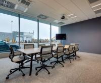
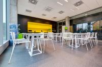
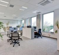
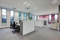
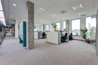
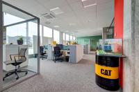
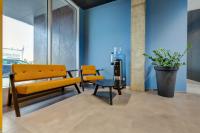
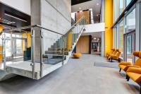
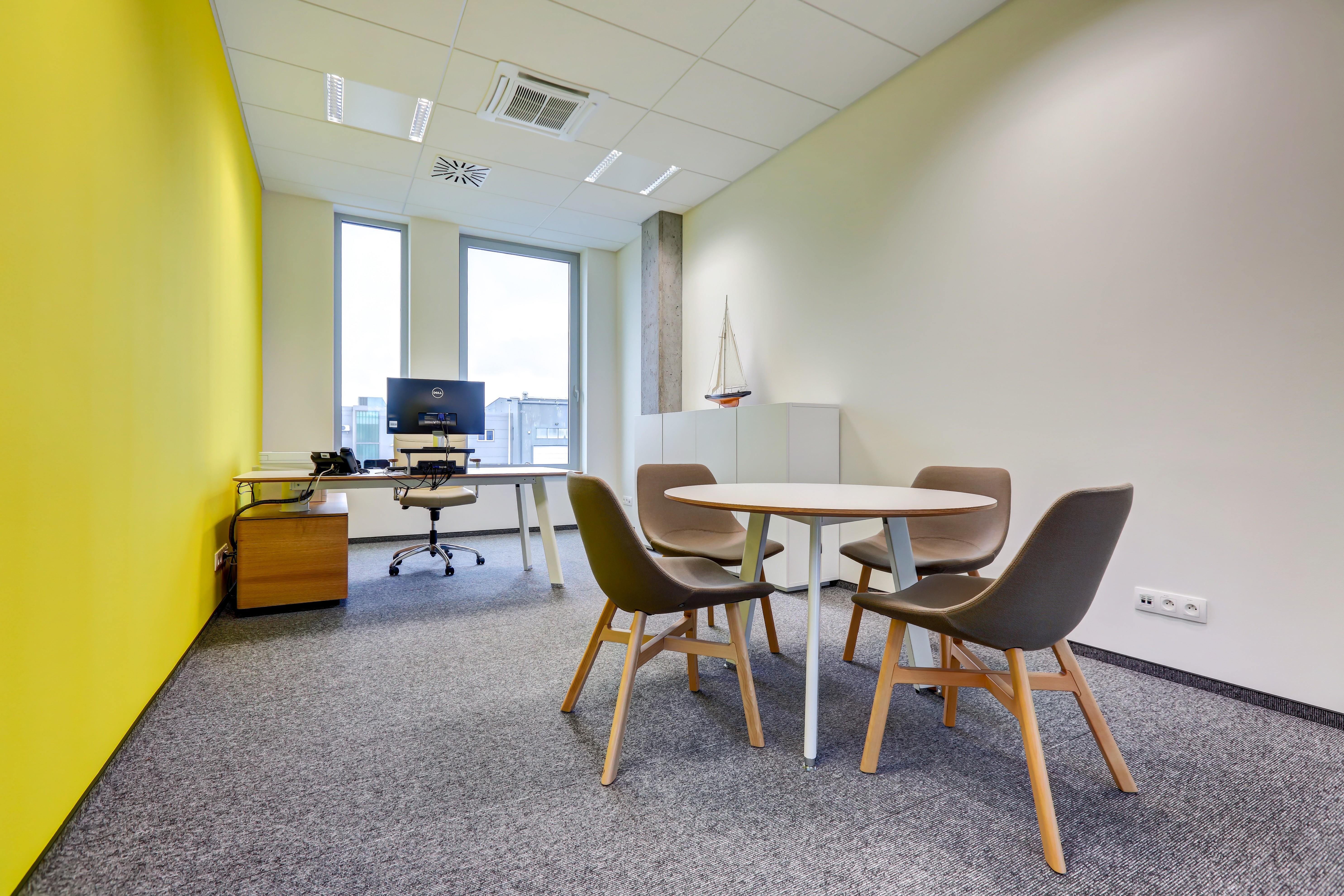
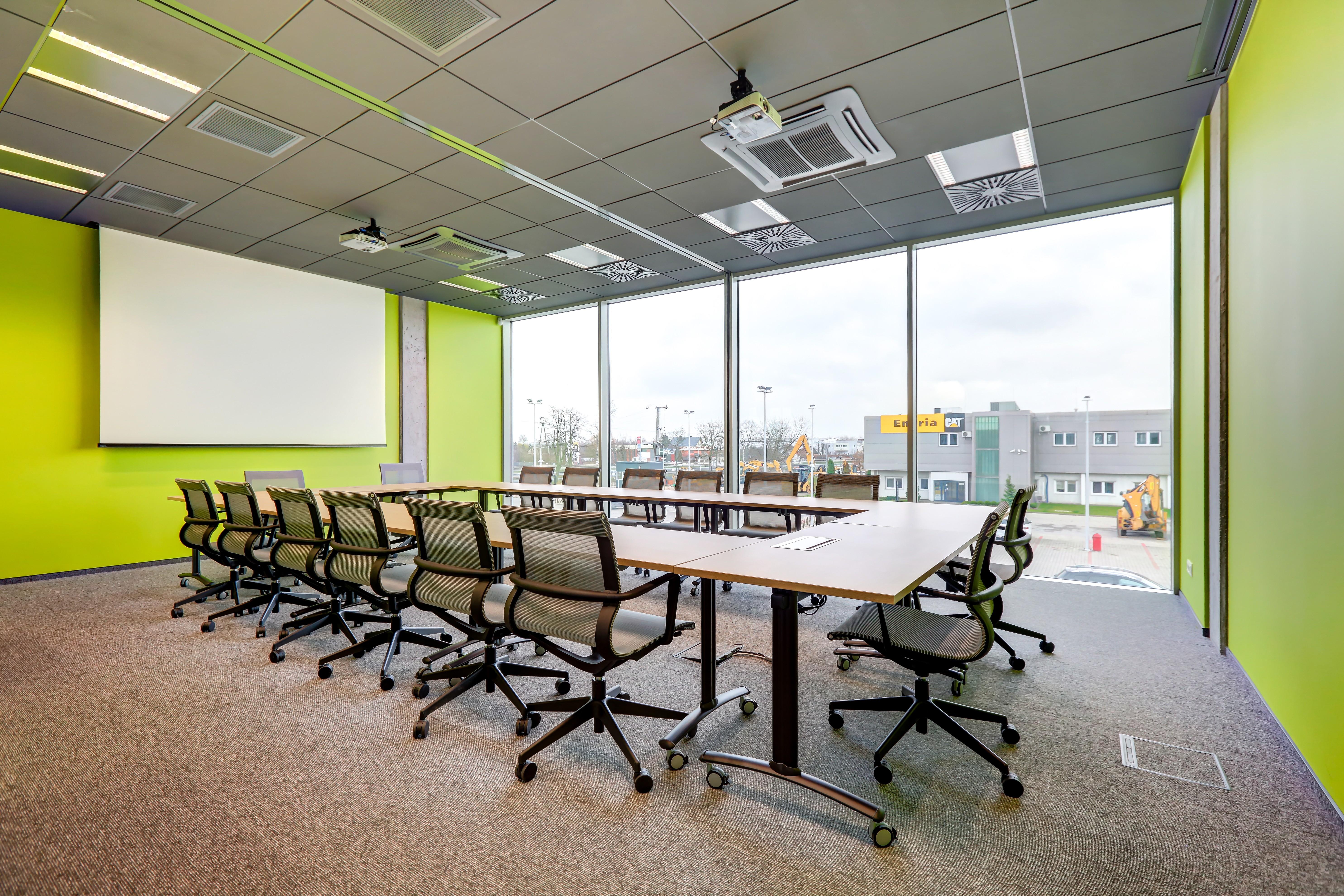
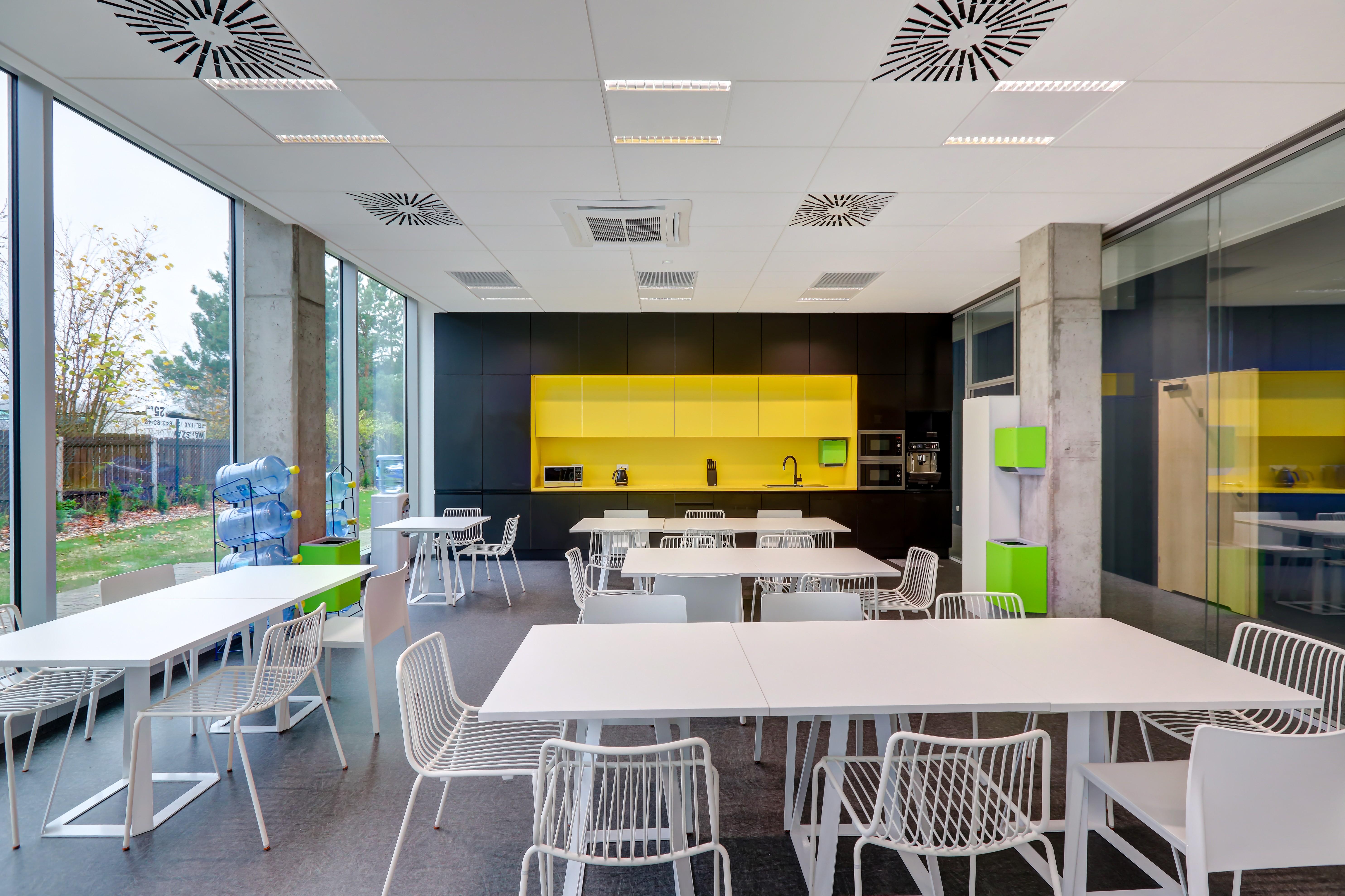
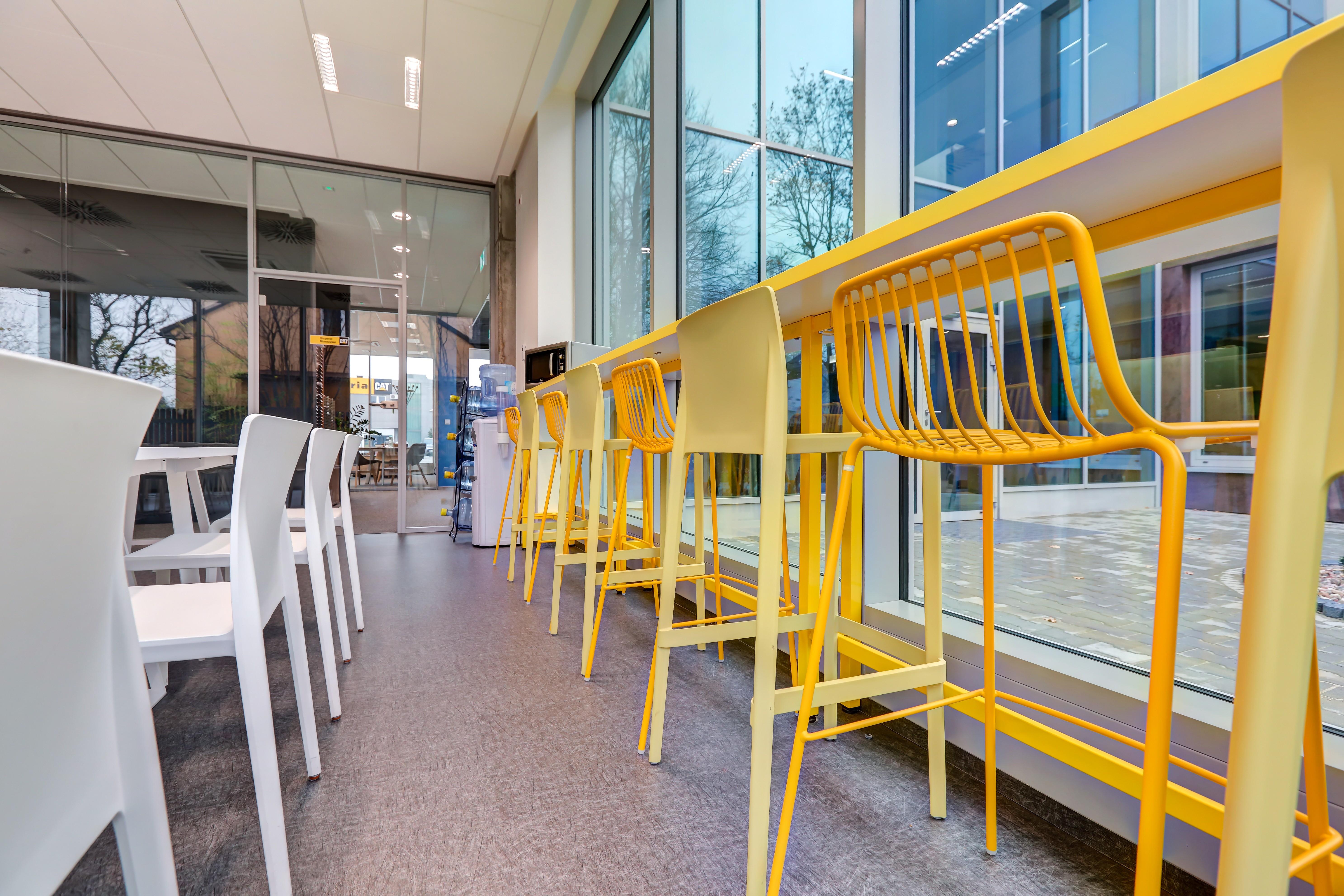
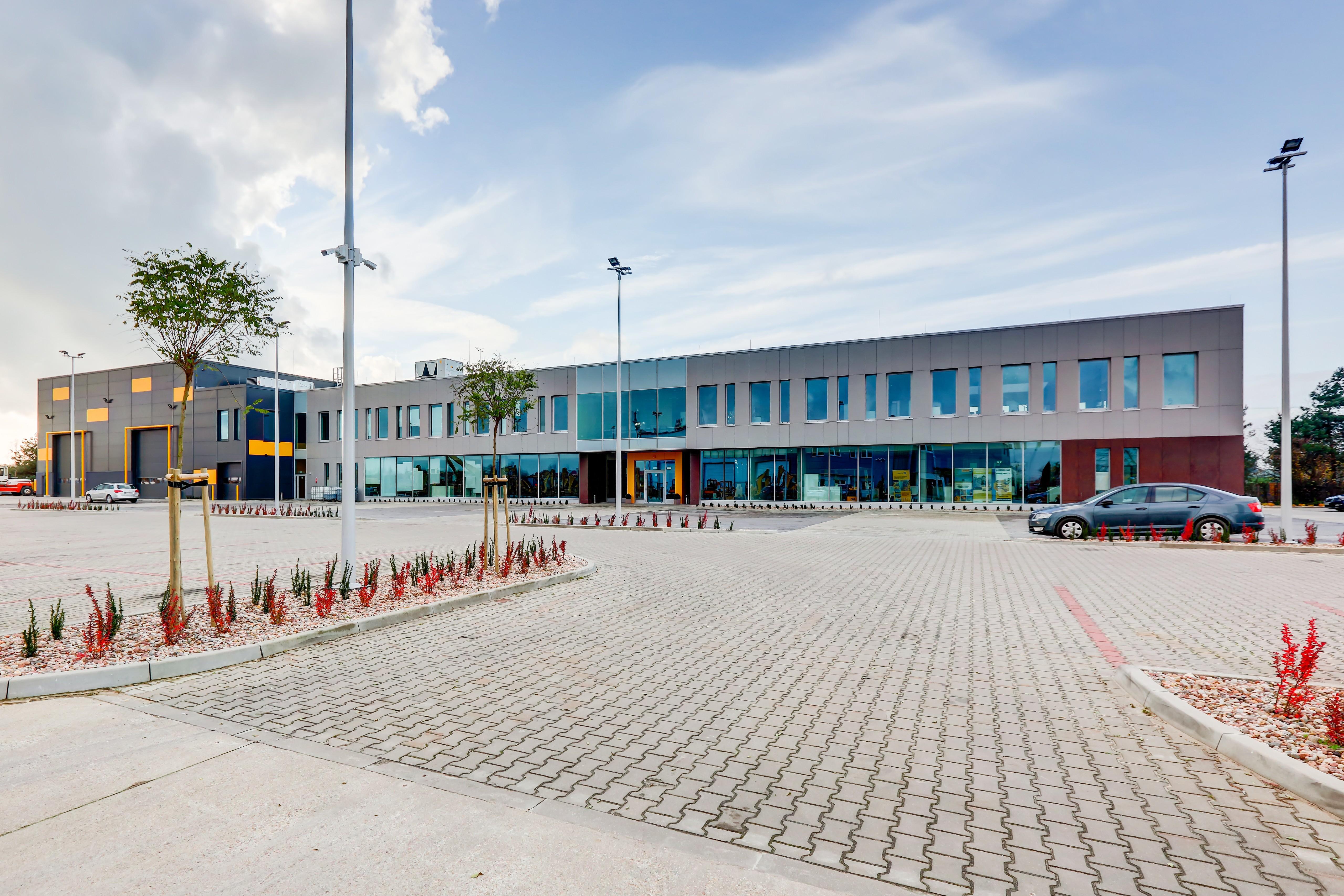
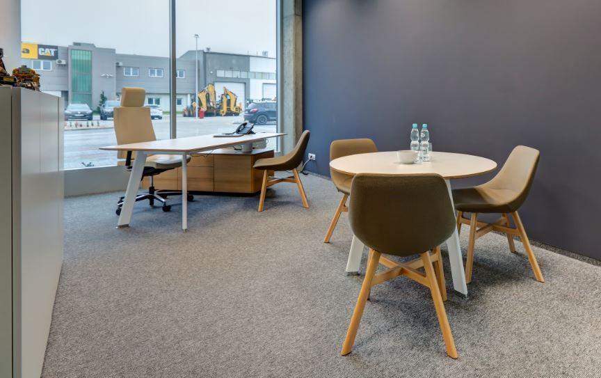
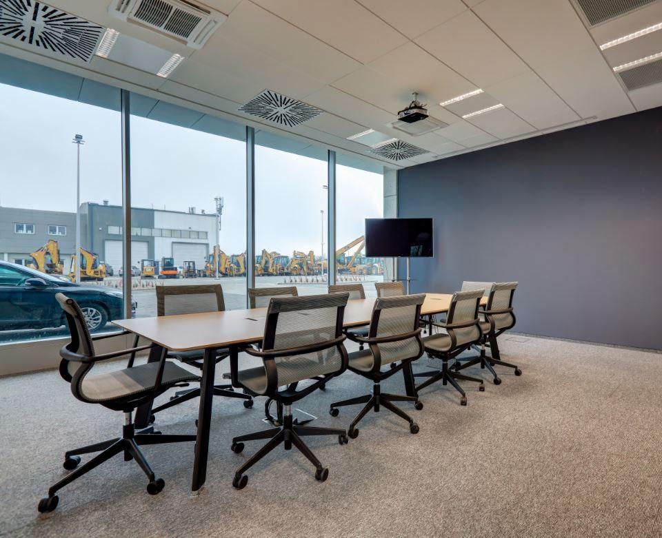
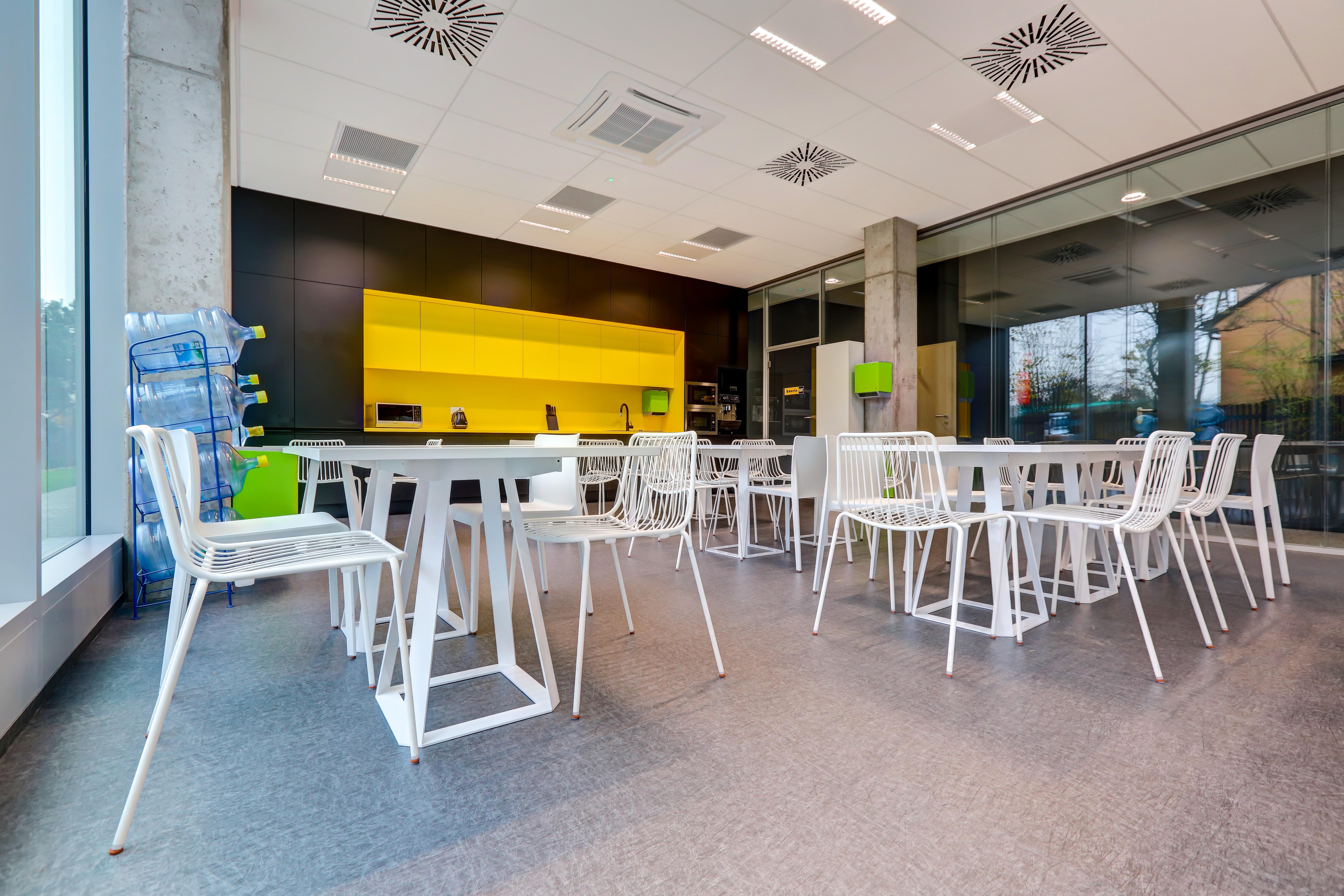
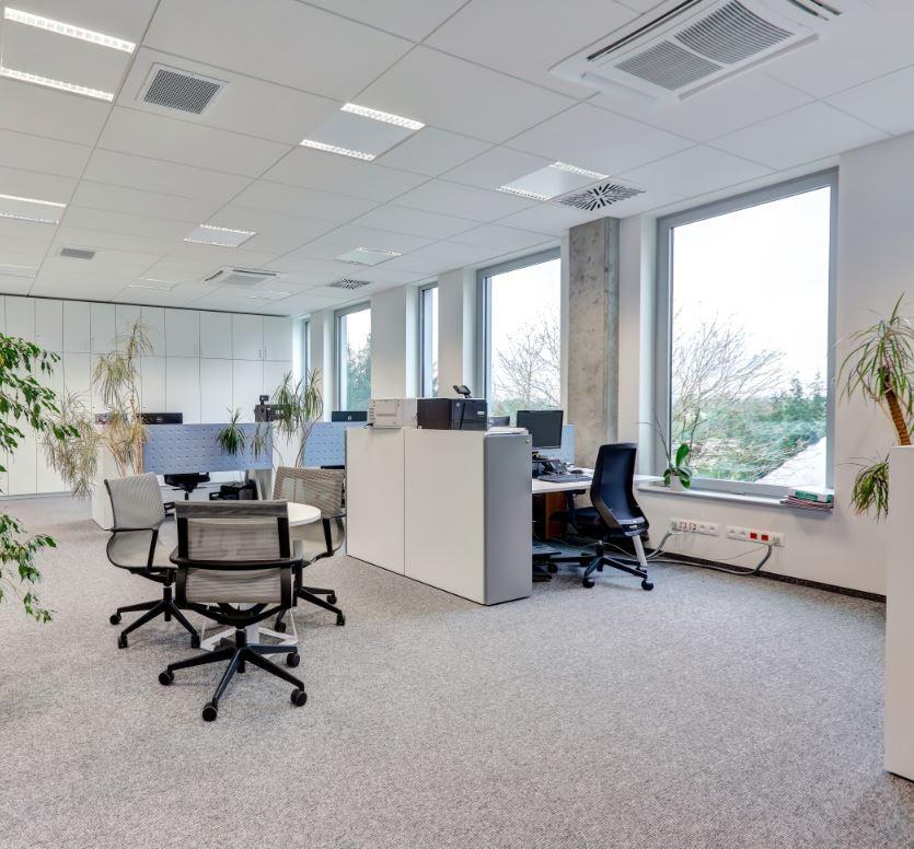
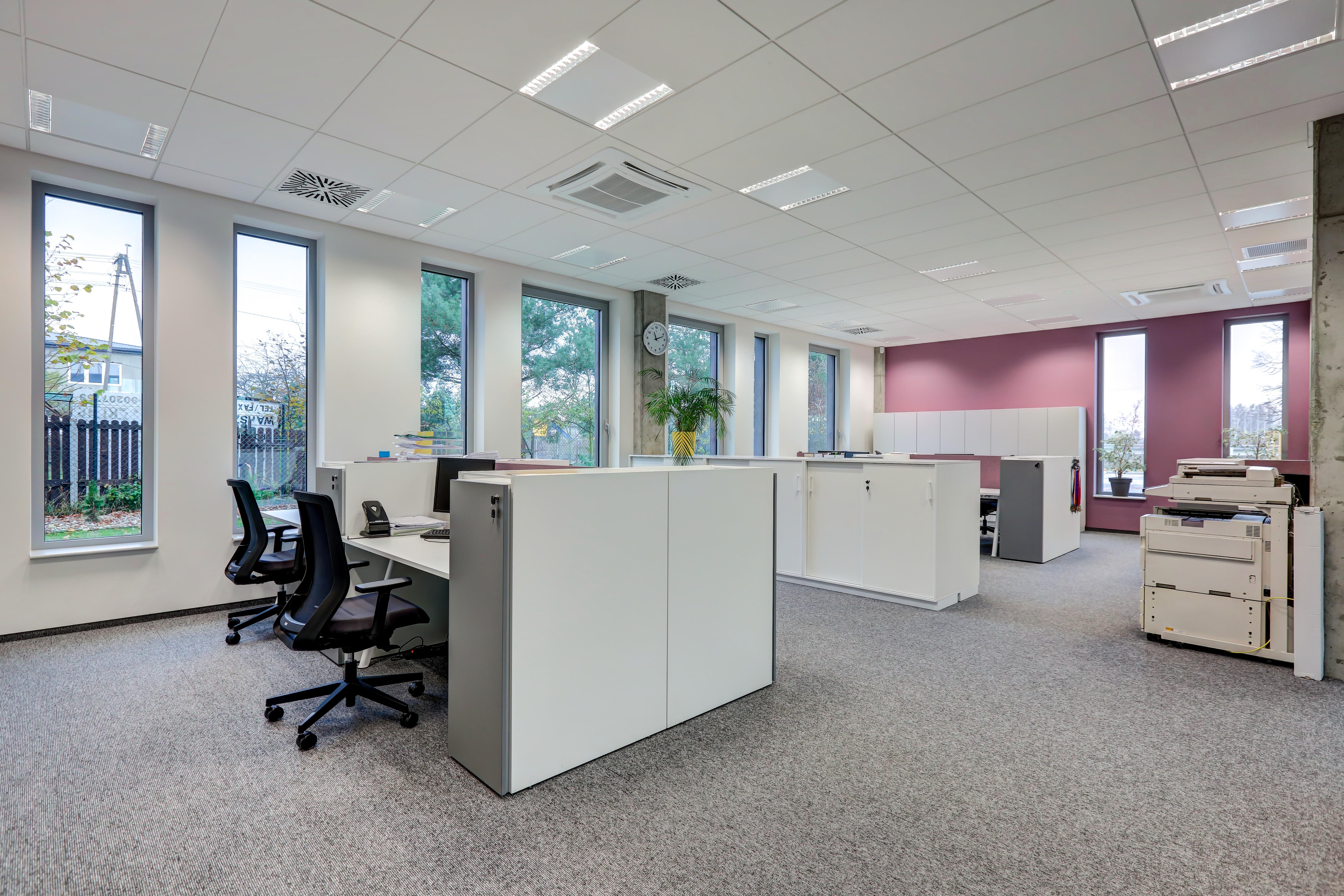
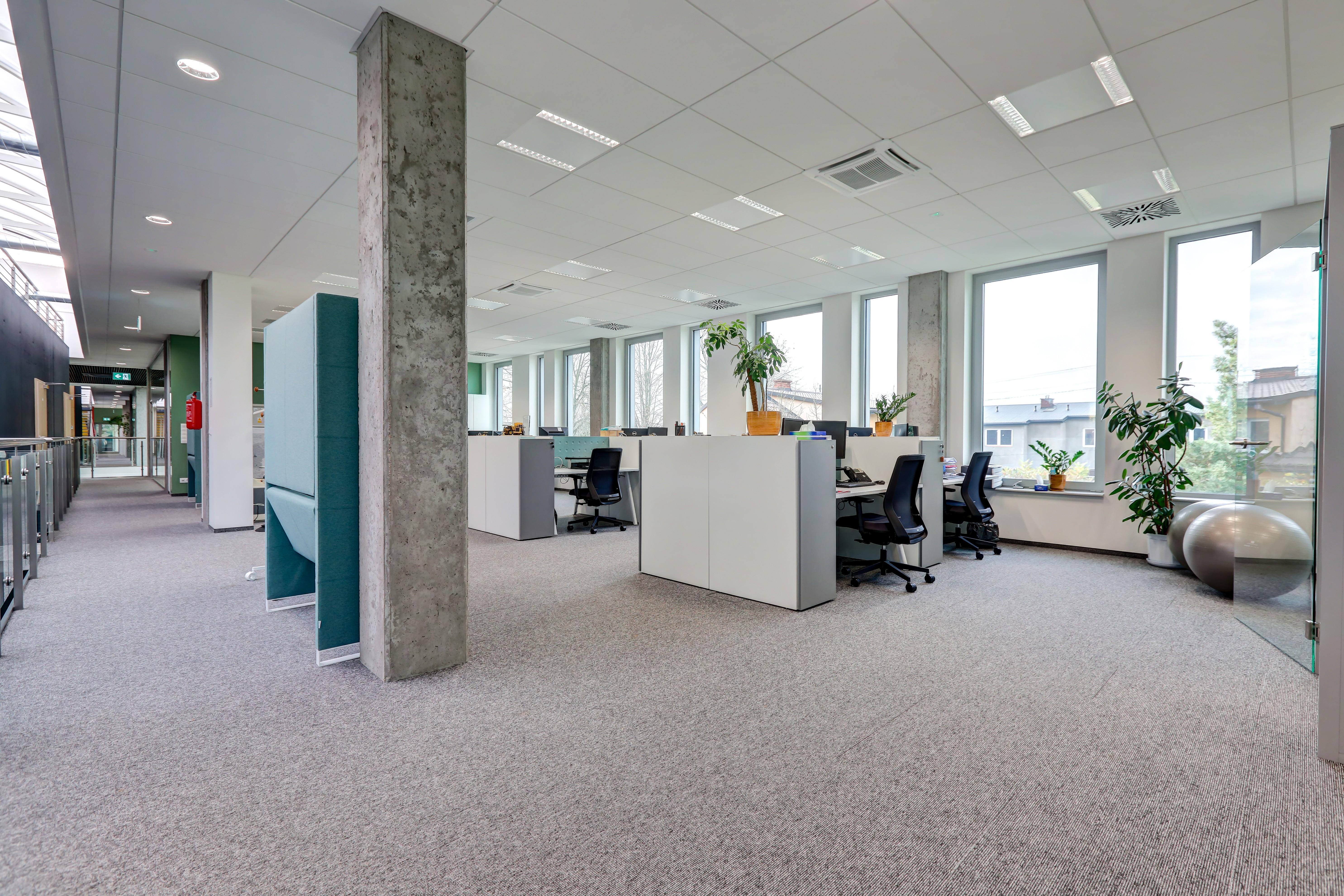
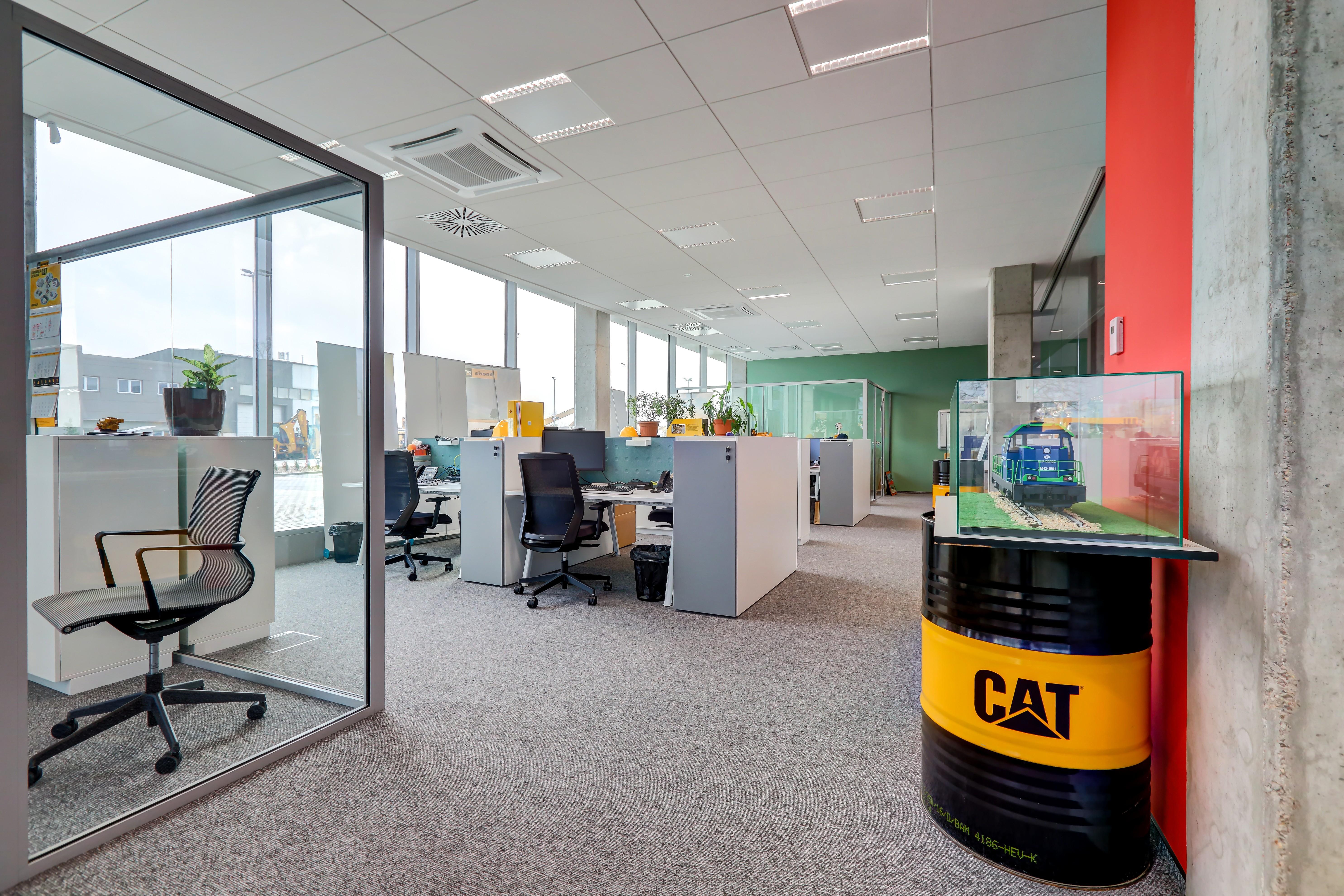
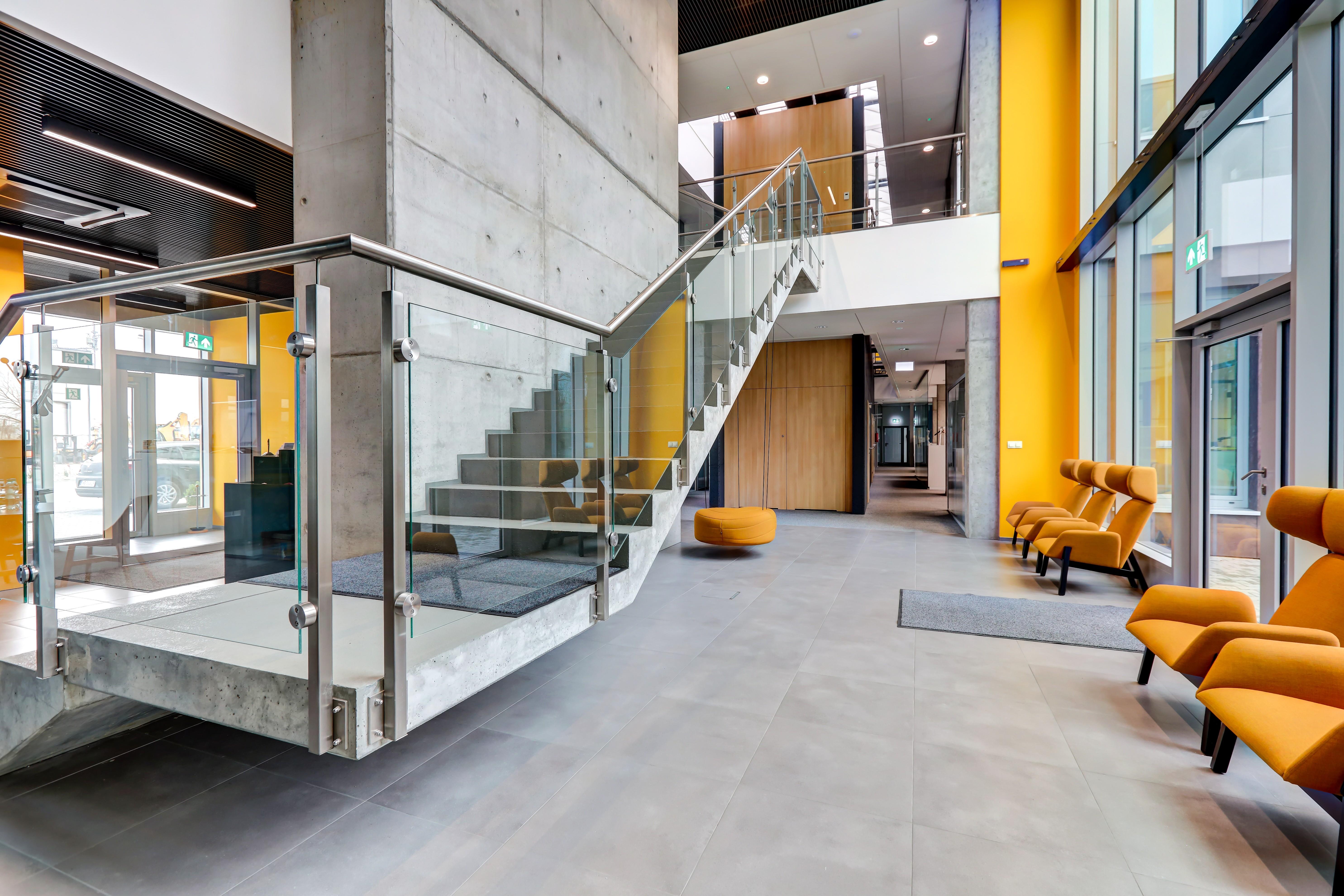
The modern, industrial design of the seat of that company with its exposed concrete elements was expertly enlivened by soft furniture pieces and intense colours. Next to the entrance you will see a minimalist FURONTO reception desk and the soft furniture from NOTI with upholstery fabrics perfectly corresponding to the CAT colours. The daring design of the canteen does attract much attention. The contrasting colours of the brand have been used in the kitchen furniture, while the whole canteen is divided into two zones, visually separated from each other by the monochrome used in each zone.
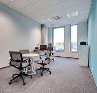
The colour itself plays a significant role in the project. In an open-plan office the colours can mark separate zones. Every department has been assigned a different colour. Such a solution makes the communication easier and adds some fresh energy into the office having the industrial interiors in the background.
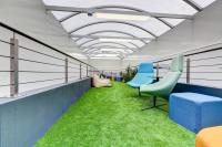
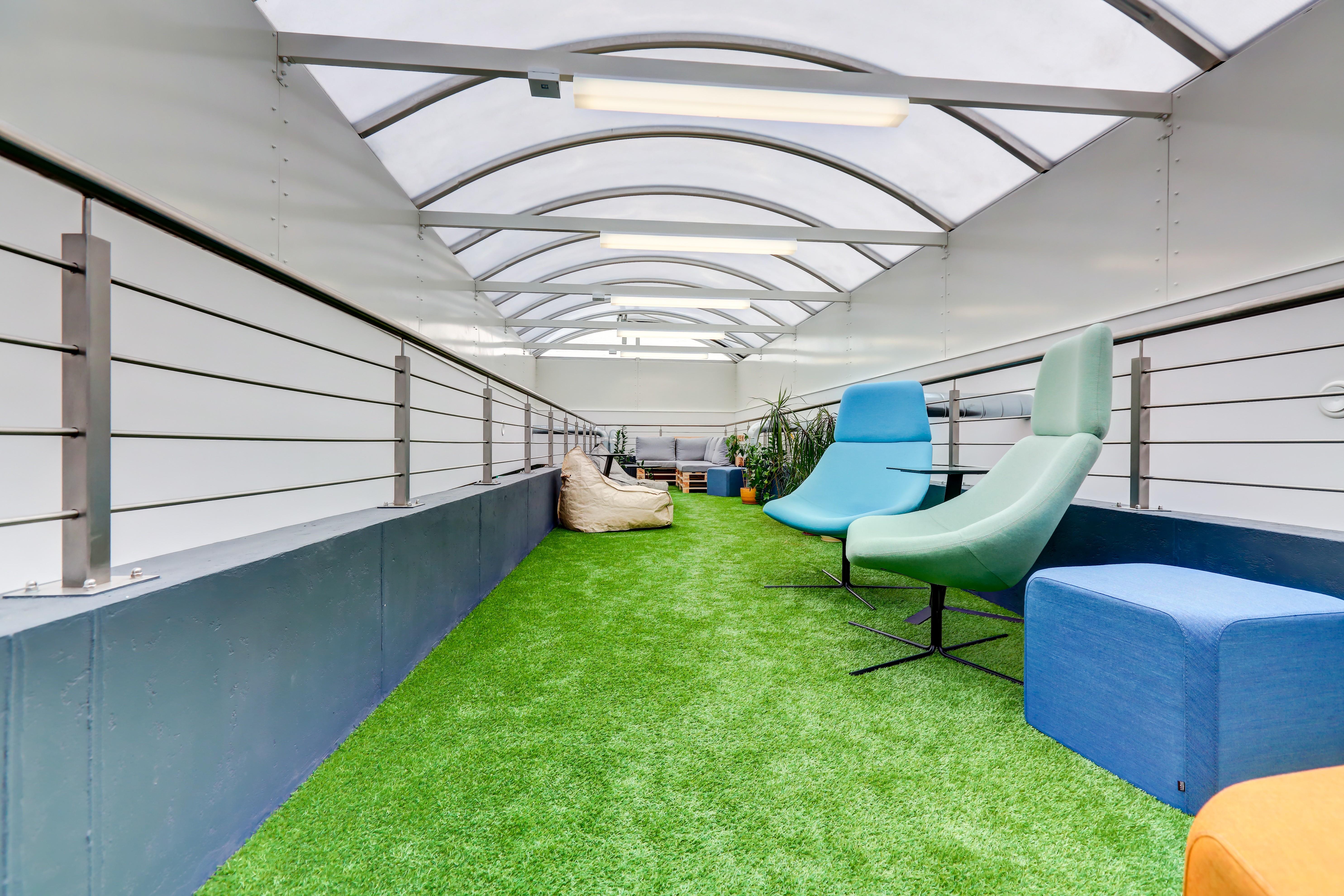
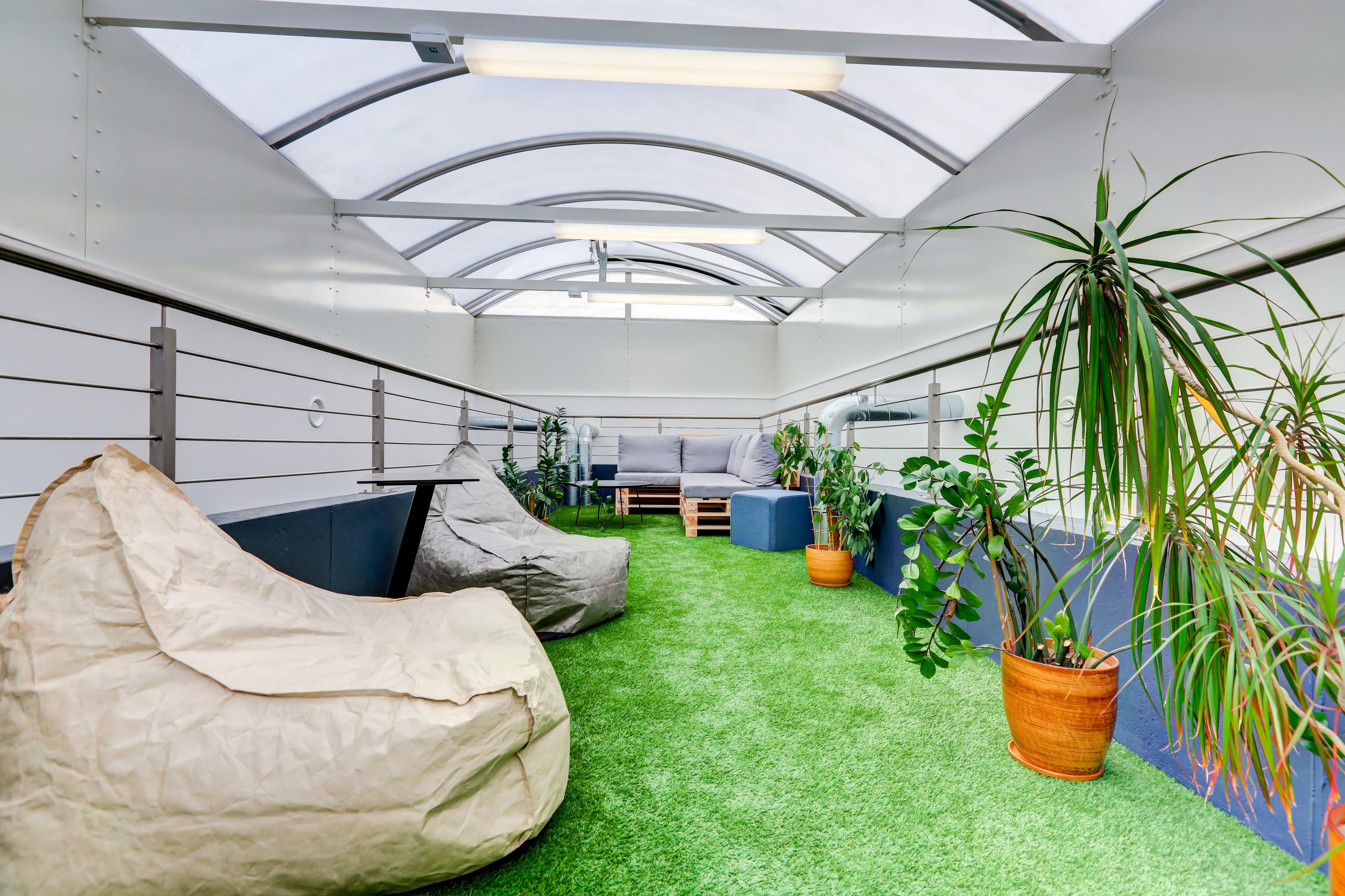
The true icing on the cake is the chill out zone, located on the top storey of the building. That place adopted the form of a “garden”, in which you can let yourself relax a while.
