Space as a metaphor for data-driven SEO and CRO
The new headquarters of Pikseo is designed around the idea of space—not as decoration, but as a metaphor for the processes behind data, algorithms, and strategy. The concept also draws from Toruń, the city of Mikołaj Kopernik, long associated with discovering order and shifting perspective—much like marketing work that happens in complex, often invisible systems.
A subtle concept translated into form, materials, and light
Based on this idea, Aleksandra Hyz and Aleksandra Mętlewicz created an interior concept where the cosmic narrative is expressed through form, material, and lighting. The design avoids literal symbolism, relying instead on restrained references that build a consistent spatial structure.
Each floor as a separate “slice of the universe”
Every level is designed as an individual fragment of a larger universe. Different color palettes and moods support different work modes—from focused individual tasks, through team ideation, to rest and social integration—while improving wayfinding and giving each floor its own identity within a coherent whole.
Materials and lighting that shape the atmosphere
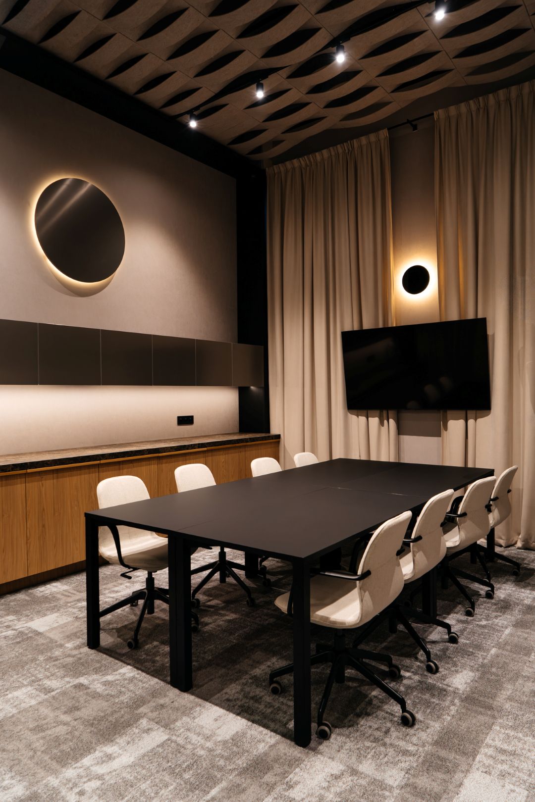
The “space” presence comes through materials and light: metallic surfaces with varied textures, flowing ceilings, rounded forms, and precisely planned lighting. Controlled graphic elements inspired by orbits and celestial bodies complement the architecture rather than dominate it.
Open space designed for focus
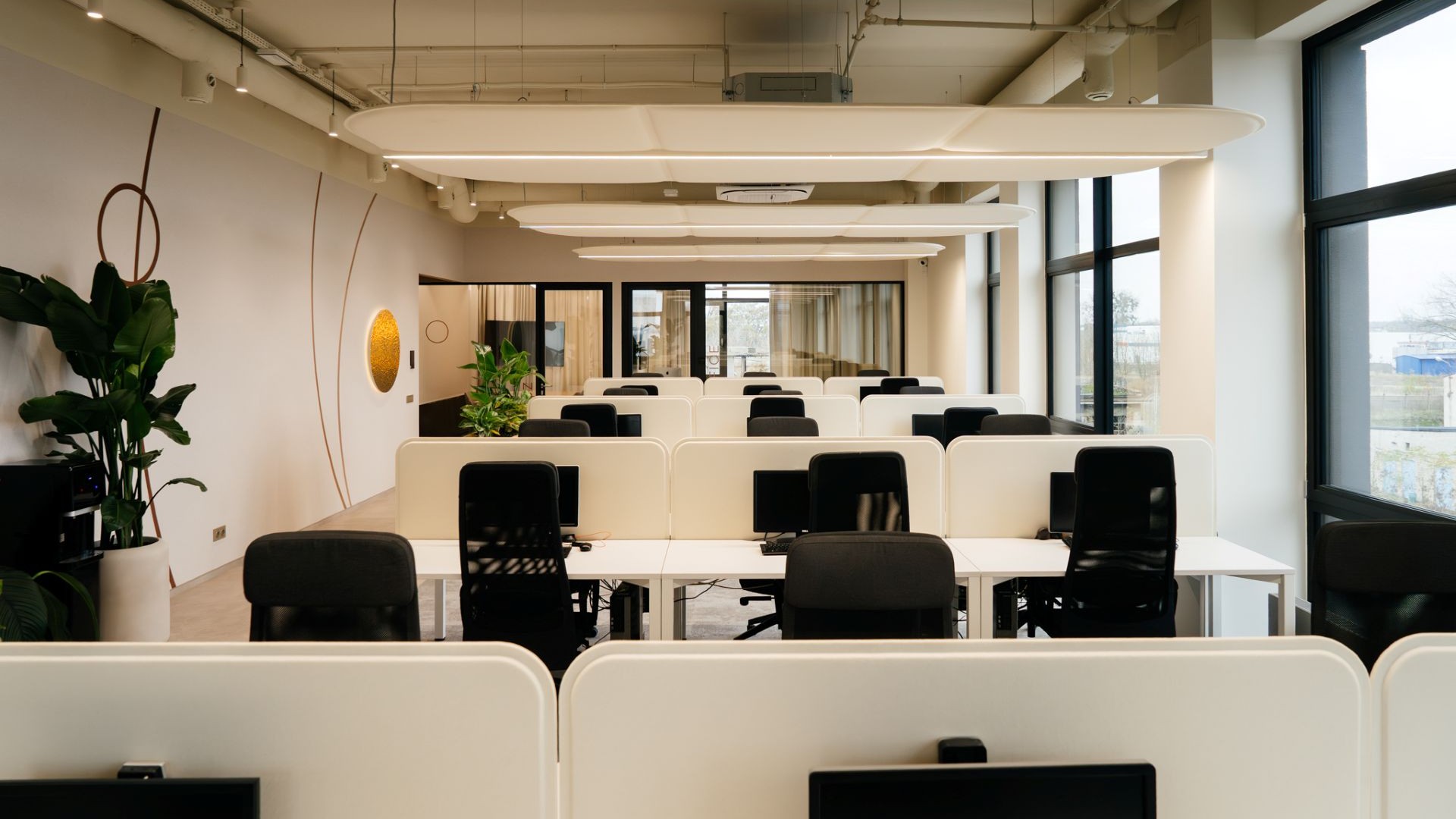
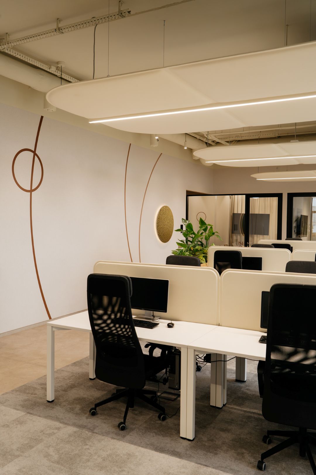
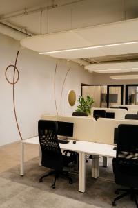
Open-plan areas are bright and orderly, built to support deep concentration. Ample daylight, acoustic care, and the soft lines of acoustic ceilings enable long, demanding work sessions. The cosmic story is quieter here—neutral and functional—yet reinforced through details like curved forms, metallic accents, wall graphics (arcs, planets), and the color identity of each floor. Symbolic references appear in lighting fixtures, neon elements, acoustic panels, and wall features.
“Planet” meeting rooms and canteens with adaptable moods
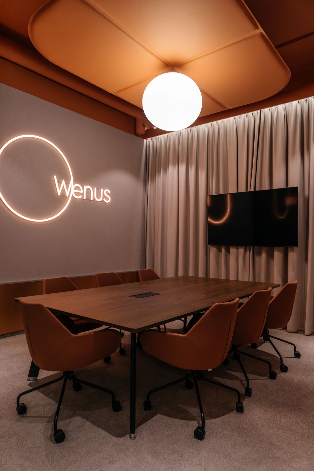
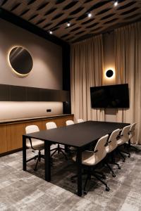
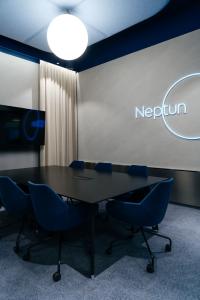
Canteens and conference rooms—named after planets like Mars or Mercury—have clearly defined characters. Materials, colors, and programmable lighting scenes shape their identity and allow the atmosphere to shift with needs: bright and work-oriented by day, then more intimate, saturated, and abstract after lighting changes.
Nebula and Aurora: flexible spaces for quick collaboration
Shared and individual work zones called Nebula and Aurora function as flexible areas for short meetings, brainstorming, and small-team work. Nebula is a sequence of compact meeting rooms that repeat rhythmically—similar, but not identical—each differentiated through nuances of light, color, and material while staying consistent with the overall concept.
The ground floor as the brand’s first impression
The ground floor is the most representative zone and the first point of contact with the brand. It combines reception, a shared recreation area with a canteen, and conference rooms—serving both guests and the team as a place for meetings, exchange, and integration.
Reception: dark tones, metallic depth, and “planet” lighting
The reception area uses a darker palette contrasted with large metallic surfaces in varied finishes—smooth, brushed, mirror-like, and textures reminiscent of fluid matter. Lighting plays a narrative role, selectively revealing key elements rather than illuminating everything evenly. Central spherical fixtures evoke planets, while flowing light lines reference motion and cosmic waves.
Ground-floor canteen: everyday use with a social core
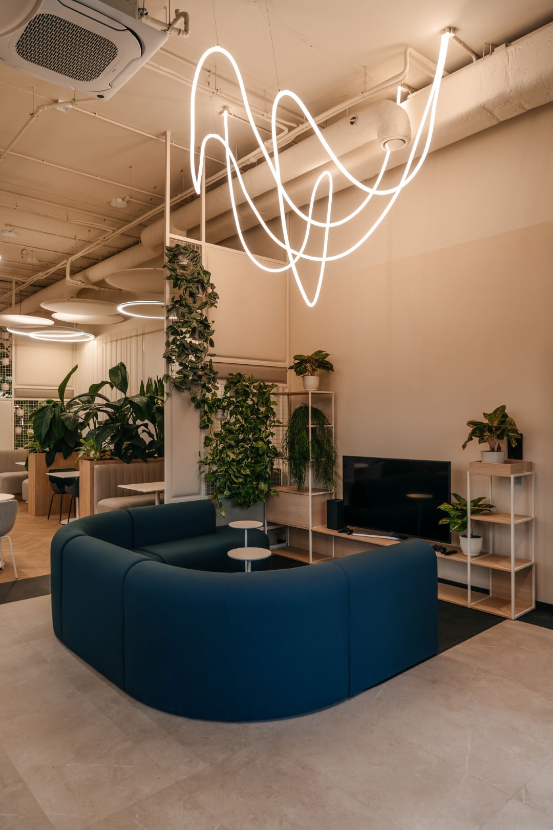
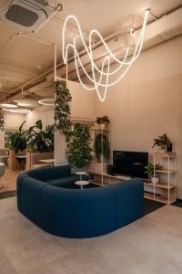
The canteen is designed as a shared daily space for breaks, meals, and informal conversations—intentionally different from a typical office cafeteria. Instead of one uniform room, it offers distinct zones for lunch, relaxation, and recreation (including games). Functionality leads, while the space theme appears only in details: neon accents, irregular linear lighting, and metallic materials.
A cohesive workplace ecosystem—concept over literal imagery
Overall, the new Pikseo headquarters creates a coherent, layered work environment where the idea of space is filtered through user needs and brand character. It operates on the level of concept, structure, and experience—not literal references.


